Chapter 7. Wireframes
![]()
A simplified view of what content will appear on each screen of the final product, usually devoid of color, typographical styles, and images. Also known as schematics, blueprints.
Wireframes are diagrams based on the simple idea that you can best describe the interactions of screen-based products by removing any aspects of the design incidental to its behavior. A wireframe is, ostensibly, a simplified view of a screen, devoid of any aesthetic beyond the barest minimum and the most neutral. The aim is to focus the team’s attention and encourage conversation about what a screen does, not what it looks like.
That’s the theory, anyway.
In reality, wireframes remain one of the most controversial tools on your utility belt. Even within their narrow definition, there is a lot of wiggle room. Designers disagree on the role of wireframes in the design process, their ability to communicate behaviors, and what “barest minimum” aesthetic means. They disagree on how closely the wireframes need to align with actual screen layouts and how much real content a wireframe should show.
Now, a bit of advice from Dan the Dad, instead of Dan the Designer. Don’t get baited into religious wars about wireframes or any design document. Know what you have available to you. Know the strengths and weaknesses of every tool. Apply the right tool for the job. Do you think Batman stopped carrying around grapple cables once he had a hang glider built into his cape? (Apparently, all my fatherly advice relies on comic book mythology.)
Anyone who tells you the design process is absolute doesn’t make a living doing it.
Introducing Wireframes
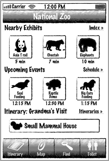
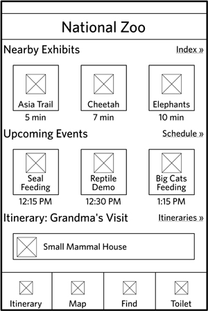
Wireframes represent screens, or portions of them. They are meant to evoke what users will actually see when they use the web site. Figure 7.1 is a wireframe for the Zoo iPhone app.
Figure 7.1. A example of a wireframe for an iPhone screen.
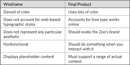
How is this different from the final design? Table 7.1 compares and contrasts the actual product with its wireframe.
Table 7.1. Comparison of wireframes and final product. Devoid of style, wireframes may seem like a waste of time. If you’re not designing the page itself, what are you designing?
You might see these things as deficiencies, and some web designers think they render wireframes a useless tool.
If, to you, these deficiencies hamstring the design process you use, you can do things to overcome them. You can incorporate wireframes into a functional prototype, so that when users click on the buttons, something happens. You could use real content wherever possible, or create several versions of a wireframe to show how the design would support different content in different scenarios. You could use components for wireframes that more closely resemble the design standards for your web site, as in Figure 7.2.
Figure 7.2. Two buttons, both alike in dignity. A button in a wireframe can be plain, or it can start to inject elements to make it seem closer to the final design.

But now let’s talk about what wireframes can do:
• Provide a fast, easy way to present concepts for interfaces
• Focus on underlying logic, behavior, and functionality
• Enable rapid iteration on design concepts
Wireframes are a fast and relatively inexpensive tool for showing interface ideas. I can put together a deck of wireframes pretty quickly. At the very least, I can go from design idea to picture fast enough to keep pace with the creative process.
Since wireframes remove much of the aesthetic qualities of a design, they encourage the project team to talk about how a web site behaves, and everything that comes with that. Wireframes focus the team’s attention on:
• The kinds of information displayed
• The range of functions available
• The relative priorities of the information and functions
• The rules for displaying certain kinds of information
• The effect of different scenarios on the display
Wireframes, despite their power, thrive only when supported by additional information. They tell a piece of a larger story, and must be incorporated into some vehicle for elaborating that tale. Like any thing representing something else, wireframes on their own leave room for interpretation. Combining them, the pictures, with words, closes this gap. This chapter focuses on the diagram itself, but toward the end of the chapter you’ll see how to combine words with pictures.
Challenges
To say that wireframes are the most controversial diagram in this book would be implying that the other diagrams are even remotely controversial. Wireframes are in a universe of controversy all their own.
The debate around the utility, value, and function of wireframes is healthy: It forces the design community to think deeply about the diagram and its role in the design process. Over the last couple of years, the case against wireframes has yielded two main criticisms. Unfortunately, these things are polar opposites, creating a tension that makes it difficult to determine the best wireframing approach.
Realism
Because much is sucked out of wireframes to keep them focused on what’s important for their core purpose, the wireframes lack realism. Typically rendered in a vector-based drawing program (such as Visio, Illustrator, InDesign, or OmniGraffle), they don’t reflect web-based layouts. A vector drawing can’t emulate layout in a browser.
Wireframes, often flat drawings, don’t effectively demonstrate interactivity. The web’s modern front-end technologies allow a greater depth of interactivity in the browser itself, and a flat drawing can’t show this. Carousels, in-page tabs, accordions, expanding panels, hovers, and other devices are the mainstay of modern web UI design. (Wow, I feel old. “Kids, back when I was a web designer, we didn’t have any of your fancy JavaScript tricks. AJAX? Luxury!”)
Because wireframes usually describe templates, they need to demonstrate what real content will look like on the page. Logistical challenges aside (maybe the content hasn’t been written) wireframes are mediocre at showing actual content.
Burden
To overcome wireframes’ deficits, some designers try to push them closer to more realistic web pages. Wireframes at their heart answer two questions:
• What types of information go on the page?
• What are their relative priorities?
Presented with complementary words, wireframes can answer other questions about behaviors and business rules and states, but (in my mind) that’s really a part of “what goes on the page.”
But because wireframes look like real pages, we sometimes want them to answer other questions, like:
• What does real content look like on this screen?
• Where does the “fold” cut off this screen?
• What are the character counts for each field?
• How many pixels do we have for this image?
• Can we get these two things to line up?
• Can you round those corners?
Attempts to answer questions like these inside the wireframe will distract from the core purpose and misapprehend what a wireframe can do.
The real challenge of wireframes is knowing where their capabilities begin and end, and how much they can be burdened with addressing these concerns. This is not limited to the questions you just saw. As web design becomes more sophisticated, we will be confronted with new questions. Wireframes will not become obsolete (after all, a hand-drawn sketch is a wireframe), but we designers will need to assess whether they are capable of answering new questions.
Anatomy of a Wireframe
By understanding a wireframe outside the context of a laid-out web page, the central function of the diagram emerges: Wireframes describe the content of a web page and its relative priorities. In this case, “content” refers to anything users might see or interact with on the page.
These days, most wireframes represent templates, a framework for displaying similar kinds of information. When you design the product page of a web site, you’re not designing a page for each and every product in the catalog. You’re designing one template that might be used by all the products, or a reasonable percentage of the catalog.
The Zoo iPhone app has one template dedicated to exhibits, one for events, and another for animals. The Zoo has dozens of exhibits and events, and hundreds of animals, so these templates are reused to display this information.
Throughout this chapter, I’m assuming you’re designing templates. I’m assuming that your pages are containers meant to hold content of a particular type. And this is where the anatomy of a wireframe begins: simple descriptions of what goes on the page.
Table 7.2. Three layers, increasing in complexity and challenges.
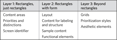
Layer 1: Rectangles, Just Rectangles
Wireframes start with rectangles, carving out areas of the page or screen to dedicate them to different kinds of content. The most basic wireframe is a rectangle (the page) chopped up into smaller rectangles.
Content areas
A content area is a region of a page with a single, discrete purpose. You should be able to state the function of a content area in a sentence, maybe two, but no more.
• This area of the page lists recent headlines.
• This area of the page is where users provide their contact information.
• This area of the page identifies the purpose of the page, letting users know where they are on the site.
• This area of the page allows users to see what else is on the web site.
It’s rare for a web page to contain only one content area. So the basic wireframe diagram will consist of several connected rectangles. Not all rectangles are created equal. There are several types of content areas you’ll work with:
• Structural areas: Even though your site may use multiple templates, there will be some common elements across templates. On many sites, the header and footer remain consistent, regardless of what template you’re looking at. Areas common across all templates generally establish an overall structure for the site.
• Reusable or shared areas: Even if a content area isn’t repeated on every template, you may have some content areas that you want to use on more than one template. The exact content may vary from page to page, but the content area structures the information in the same way. A list of headlines is a good example, or a carousel at the top of some pages.
• Unique areas: Not every template will simply mix and match shared content areas—that would make for a boring site. Individual templates have a distinct purpose, and must display unique content to serve that purpose. In our Zoo iPhone app, the animal template shows a large photograph and “animal stats,” content areas not used elsewhere in the app.
Rectangles should be labeled, to indicate their purpose. Structural areas will have unique names, like “global navigation” or “header.” You can’t have multiple “header” areas on a single page. Likewise, when you see “header” on different templates, you imply that the area appears the same on both, with perhaps only minor variations.
Reusable areas also have names to describe their purpose, but these might be repeated (a list of headlines may be used multiple times on a single template, for example) and further qualified to clarify the exact content appearing in that area.
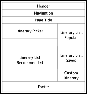
The Zoo’s web site has (in my imagination) a companion application to the iPhone app. On the web, you can download different itineraries to your phone. The site provides lists of itineraries that you can dig into and choose from. The starting page for this part of the web site actually has two lists of itineraries: one that displays the newest ones and one that displays the most popular. If I call that shared area “itinerary list,” I can create a wireframe like the one in Figure 7.3.
Figure 7.3. A simple wireframe shows page regions, identifying them with labels. In this case, the “itinerary list” is an area that’s used twice, but to show two different sets of itineraries.
Priorities and distinctions
Besides showing the content areas on a page, a wireframe has another job—to show the relative priorities of those content areas. One way to understand this is to think further down the design process, as the team is responsible for transforming wireframes into real screen layouts. The most important direction a designer needs in thinking about the layout is “What’s the most important information on the page?”
When designers create wireframes that evoke a particular layout for the page, they are really trying to communicate priority.
The simplest way to show this is to list the content areas in order, with the most important one first. You might not actually deliver wireframes to your client that are just lists of content areas, but such lists are useful exercises for planning wireframes.
You might be asking yourself, “Should I put the header first?” The header is at the top of the page, but is it the most important thing on the page? I’ve done it both ways, listing the header lower in the page priorities to encourage the designers to truly think of the first item in the list as the main focal point for the page. I’ve also listed the header first to remind them that they have structural areas that are immutable.
On some projects, I use a format called Page Description Diagrams. This approach shows a visual ranking of content areas, but isn’t quite as absolute as a single list.
Another way to address this is to define page regions—common areas of the page. Figure 7.4 shows page regions for the Zoo’s itinerary app. With those regions defined, I accomplish two things:
Figure 7.4. A page description diagram groups content areas into high, medium, and low importance. With such an approach, you can avoid having to put together an absolute list of most important to least important.
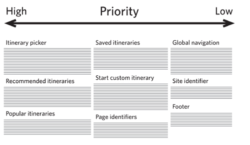
• I communicate to the design team that the basic structure of the page has four basic areas: a header to identify the page, a main body to hold the essential content, a sidebar to provide supporting content, and a footer to anchor the page. Though described in a graphic way, they’re really conceptual.
• I can prioritize content in each of these areas. Thus, the itinerary picker is the most important content area in the body region.
There are other pieces of information you might want to communicate about the content areas:
• Their function: Navigation, list, content, promotion, and so on
• How they relate to web site operations: Manual versus automatic content management, where the content is sourced from
• Any issues related to project logistics: For example, distinguishing content areas based on the phase in the project in which they’ll be designed
At this level, showing only content areas without much detail, there’s really only one way to distinguish them visually: through color. Assign each type of content area a different color. You can use these designations throughout the document to elaborate on the structure and function of the content areas. If purple always means navigation, it means readers of the documentation know that whenever they see purple, the document is describing navigation.
Screen identifier
Before leaving the barest essentials of wireframes, I’d like to talk about how to label the screen itself. Every template should have a name (because it represents a unique configuration of content areas). I like naming them based on the primary purpose of the page or the primary type of content on the page.
A sophisticated site may require that screens have further identification:
• Variations: A single function (like displaying product or animal information) may actually require multiple templates. The iPhone app, for example, may use two different templates for displaying exhibits—indoor exhibits and outdoor ones. The exhibit template has two variations, which may amount to some relatively subtle differences, but enough to warrant the distinction.
• Codes: For sites with more than a dozen screens, the design team will benefit from attaching codes to screens. These codes provide a convenient shorthand for referring to the screens, and provide a built-in approach for identifying variations.
Layer 2: Rectangles with Form
If you think you can’t get away with a straight list of labeled rectangles for your wireframes, the second layer of elements forms up the page into something more recognizable. Tread into this layer with caution: making the structure of a page look like an actual page comes with risks.
Layout
When you give the rectangles of a wireframe a layout to resemble a web page, the wireframe communicates more than just relative priority. The wireframe evokes what a web page could look like. The project team, looking at a wireframe with layout, still needs to make the leap from vector drawing to browser rendering.
Laying out a page means considering the height and width of the rectangles, because priority is communicated not just by placement on the page, but how much of the page the content area occupies.
Figure 7.5. Using the dimensions of a rectangle to communicate priority. The bigger the content area, the more important it is, even if it is not very high up on the page.
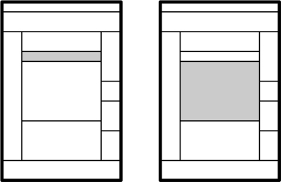
A layout gives the project team better insight into your vision for the relative priorities of information on the page. It establishes a starting point for the design team to explore.
Don’t put too much stock in a wireframe layout, though. Designing for the web means accounting for numerous other pressures (browser rendering issues, HTML standards, content of various lengths and formats, accessibility compliance, graceful degradation on the front end, and the list goes on). What might look good in the wireframe may not translate well to the web.
Content for labeling, structure, and instruction
Some of the words and pictures on a screen are not for consumption. They are, instead, wayfinding devices, helping users understand where they are on the site. Beyond navigation, they set expectations about the experience and provide instruction on how to use particular features.
In some instances a wayfinding label may vary depending on the kind of content displayed in the content area. For example, itinerary list is a content area used throughout the web site, but it comes with some business rules to define which itineraries are listed. The header for this content area can’t simply say “Itinerary List” everywhere it appears. Instead, the structural content is variable depending on the context.
You can use color to illustrate the purpose of specific kinds of text, specifically error messaging. Typically, this information is highlighted with red, an effective color for calling the user’s attention to something important. (Red, certainly in Western culture, has come to evoke “danger.”) Note that this color isn’t meant to be ported directly into the final designs—you’re not making an aesthetic decision. The color is merely meant to convey the function of the text.
Sample content
Incorporating real content into a wireframe is feasible, just so long as you do it in a way to support the purpose of the wireframe. Dropping a 1,000-word essay into a wireframe to show what the page will look like with a long article does the wireframe a disservice because (a) it assumes the wireframe does a good job of approximating the layout of the page, and (b) it undermines the purpose of the wireframe. (Dropping a 1,000-word essay in an HTML template, on the other hand, makes much more sense.)
This isn’t to say that wireframes should be devoid of real content. In fact, the more real, the better. For most people on the project team, assessing the efficacy of a screen depends on their seeing real content. For example, people may be able to make the cognitive leap from seeing a page filled with “Title Goes Here” to the kinds of content that will appear there. On the other hand, seeing real content eliminates the need for them to imagine the experience.
If you’re short of real content, you have several other options, described in Table 7.3.
Table 7.3. Representing data in wireframes can be challenging, especially with so many options available. Also, this is the only content in this chapter I took from the first edition whole-hog.
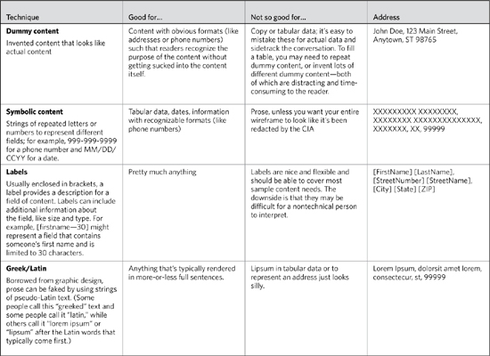
Once you start incorporating sample content into the wireframes, you can lose the borders around the content areas. With content, real or otherwise, the areas of the page become defined, even without a distinct rectangle shape.
There’s one other way to represent content in wireframes—I give you the squiggly line (Figure 7.6).
Figure 7.6. Representing blocks of content using squiggly lines inside wireframes. Depending on the scale of the wireframe, they can be used for most content so long as they’re sufficiently distinguished from other lines in the drawing.
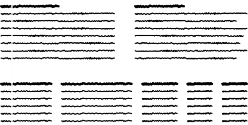
Squiggly lines are good for rough sketches. The weight of the line can give a good sense of the weight of the content. Squiggly lines, however, provide the least amount of context or direction. Unless accompanied by detailed annotations, the lines will be completely meaningless.
Figure 7.7. Simple, standard form elements used to communicate interactions give the design team the idea behind the interaction and permission to explore other interface options.

Functional elements
Wireframes can incorporate another kind of “content,” interactive elements like form widgets. Showing these interface devices (Figure 7.8) evokes the range of behaviors exhibited by the screen, and establishes the range of inputs needed from users.
Figure 7.8. Simple, wireframe-ready form elements establish the interaction and remain devoid of any specific aesthetic direction.
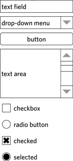
Like content, functional elements have varying levels of fidelity, and a reasonable starting point is the simplest rendition that evokes the widget.
While remaining aesthetically neutral, simple form elements also communicate the nature of the interaction, leaving open the possibility of other ways to accomplish the same function. For example, Figure 7.7 shows a version of the itinerary screen with a drop-down menu instead of a slider for the group size selector. Using a drop-down menu in the wireframe would have been legitimate, especially if I didn’t have any particular idea on how to accomplish this interaction. Acknowledging the essence of the function (user must select one from a handful) allows the rest of the design team to weigh in on interface widgets that offer other advantages. Interactions go beyond form elements. Modern web design incorporates elaborate interface elements, some of which have not yet standardized on a particular format. Carousels are a good example of an emerging interface element that has yet to land on a particular approach. Table 7.4 has some guidelines for wireframing new elements like these.
Table 7.4. Representing functional elements, for example a carousel.
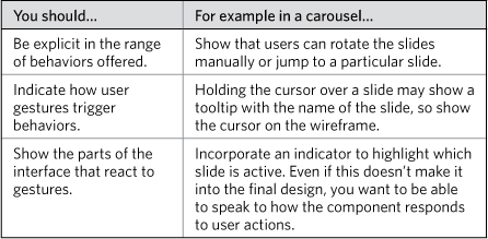
Functional elements usually have more than one state. A link, for example, can be visited or unvisited. It can also have a hover state, what it looks like when the user holds the cursor over it. Tabs can be active, inactive, or unavailable. When communicating state:
• Make sure the state accurately reflects the scenario of the wireframe. Showing an active tab with incorrect content, or an unavailable tab that should always be available, will just confuse the project team.
• Don’t use the wireframe of a screen to show all the various states of an interface element. Prepare separate, smaller wireframes for each possible state of an interface element like a tab set.
Like using red with error messages, there is a functional element that benefits from a little color in wireframes. Color links and other clickable items blue. Blue, for better or worse, is long-established as the color of hyperlinks—clickable things. Using blue for clickability helps you to focus on those elements when walking through a wireframe. You can overdo it, if there are a lot of elements users can interact with. In these instances, I use blue for things that trigger primary functions, or things that would not otherwise look clickable.
Layer 3: Beyond Rectangles
The elements in this layer polish your wireframe, but they are by no means necessary to the essential purpose of the wireframe. They may help align your screen concepts with other aspects of the design project, but they can also interfere with other activities, so apply them with caution. While they lend a certain polish to the wireframe, they also may distract from what you’re trying to communicate with the diagram.
Grid
Grids establish a visual framework for aligning the various elements on the page. It is a concept long-entrenched in graphic design that has, due to CSS, become more feasible and more accepted among web designers.
The grid’s role in wireframing is still emergent: Should wireframes use the exact grid used for laying out web pages? If the wireframe doesn’t replicate the HTML/CSS grid exactly, should it evoke a similar layout? Should the grid be functional in nature (such as a “body” column and a “navigation” column), or should it be based on dividing up the page into equal regions (for example, eight columns)?
In graphic design, grids establish a proportionality between the elements that the human eye finds pleasing. It aligns elements on the page, and creates opportunities for visual tension by breaking that alignment.
Careful alignment of content areas in a wireframe cuts both ways: The wireframe itself is more polished and may do a better job in communicating priorities, but it also evokes an accurate web page rendition, which may be risky depending on the project team.
There is one other consideration: Grids make it easier to design. If your focus is less on graphic design and more on structure and content, a grid provides a useful framework for building wireframes. Like any concept from graphic design (contrast, white space, typography, and so on), grids in the hands of an untrained designer (present company included) can be applied irresponsibly.
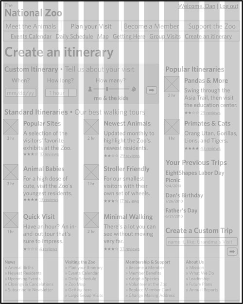
For the web page examples in this chapter, I followed a 12-column grid, using a template downloaded from the web. Whether the final web pages follow this exact layout or not, the grid made it easy to create a polished, consistent wireframe.
Figure 7.9. A 12-column grid based on the 960 framework provided a convenient starting point for laying out the examples in this chapter. Even if the final design system doesn’t use the 960 grid, the 12-column layout is easily translatable to other pixel-widths.
Tip: The 960 grid
Far be it for the web to standardize on anything, but one emerging best practice is the 960 grid. This pattern, which is—you guessed it—960 pixels wide, establishes a common starting point for a grid. Conveniently divisible, it also offers flexibility for web designers looking for a variety of column configurations. Visit http://960.gs for more information about the 960 grid and to download templates you can use in a variety of drawing applications.
Prioritization styles
Using placement on the page as the only way to communicate hierarchy, wireframes can become extremely dense. While the simplified aesthetic steers clear of making any decisions about style, it can backfire, making the page seem weightier than it really is. Typographic styles, grayscale, and moderated line weight can work in concert to explain the hierarchy of information on the page without committing you to a particular style.
Table 7.5 explains some of the prioritization styles I used in the sample wireframe from Figure 7.13.
Table 7.5. Function and priority conveyed through style help prevent the wireframe from becoming a tangle of lines and visual noise.
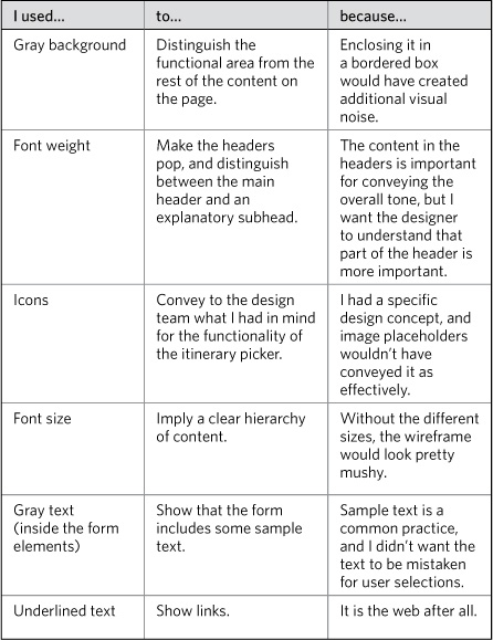
Some style in wireframes can emphasize the priorities and function, but be sure to ask yourself about the rationale for moving beyond simple rectangles. For example, I’m not sure why I rounded the corners of the background for the Custom Itinerary section.
Aesthetic elements
Aesthetic is like weather: It’s always there, you just notice it more sometimes. The paucity of color, typography, imagery, and style in a wireframe does not mean it is devoid of aesthetic. Creating a wireframe means (in most cases) using the simplest, most universal aesthetic to avoid making any concrete statement about style. Minimizing aesthetics is a common practice in wireframing because it allows the project team to focus conversations on behavior, structure, and priority.
Some second-layer wireframe elements (structural content, functional elements) discussed the use of color. It’s important to distinguish these uses of color. A wireframe may rely on color to help communicate the function or purpose of some element.
The kind of color we’re talking about in the third layer is the color that’s specifically attached to the brand. The National Zoo uses a forest green as the central color in its palette, and surrounds that green with some other earthy tones. The question we’re asking here is whether to inject the wireframe with colors from that palette.
Incorporating a bit of style into a wireframe comes with risks (will the choice of type or graphic distract from the purpose of the wireframe?), but it can lend some authenticity.
Creating Wireframes
Even with the basics, there is still a wide range of what wireframes might look like. How do you pull all these elements together? Start with some basic decisions to help focus your efforts.
Basic Decisions
Usually, this section starts with the purpose, thinking about what you want to accomplish. In this case, however, I want to first explain the range of content decisions you can make before considering purpose and audience.
Scale: Pages or content areas
In describing the anatomy of a wireframe, I assumed that every wireframe reflected a complete page. This isn’t always true. Some wireframes represent portions of pages. That is, you can create a representation of a single content area (see Figure 7.10).
Figure 7.10. The scale of the wireframe refers to whether you’re showing the whole screen or a portion of the screen. A smaller scale affords a greater level of detail about each function and an opportunity to explore all the variations of a component in the context of the component itself. On the other hand, the component may lose context being described outside its native environs: the web page.
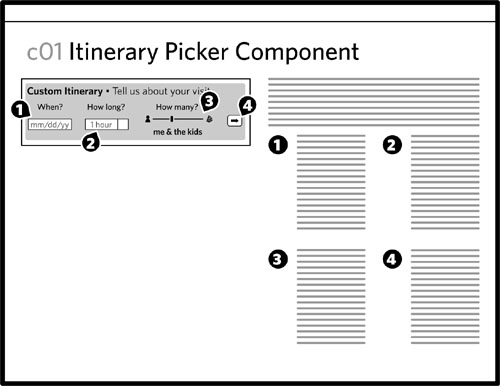
Designing the individual page components is useful if you intend to use the components again and again throughout the site (and why wouldn’t you). It ensures consistency, and its efficiency trickles down to other parts of the design and implementation processes.
Tip: Modular Web Design
Nathan Curtis’s book Modular Web Design (New Riders, 2009) is the best source on taking a Lego-brick approach to designing web sites. Curtis explains not only how to treat web design in a modular way, but also the operational aspects of developing a component library for sophisticated design systems.
Of course, this approach requires that people looking at the component drawings can understand them outside the context of a screen. It can be challenging for the project team to evaluate the quality of a design if they’re reviewing it piecemeal. Your design process may ultimately entail moving back and forth between designing screens and components.
From a documentation perspective, wireframes at either level (screen or component) face the same challenges and draw from the same techniques. Where the deliverable will differ is in the telling of the story: with wireframes of individual areas, the deliverable needs to state clearly how the components fit together, and how they might be incorporated into different screens.
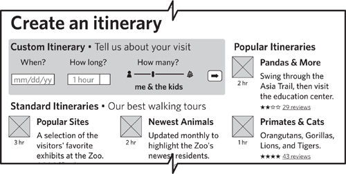
When documenting a partial page, you should use a visual cue (Figure 7.11) to help people understand that they’re looking at an excerpt.
Figure 7.11. Borders around partial pages should include a jagged edge to indicate that there’s more to the screen than shown.
Fidelity: How close to reality
As careful as the Anatomy section was in treating wireframes as virtually devoid of any style, some designers prefer wireframes that come close to a final design. This is known as fidelity: how faithful the representation is to the final product. A high-fidelity (hi-fi) wireframe looks more like the final version of the design, incorporating realistic graphic design elements. Low-fidelity (lo-fi) wireframes stick to the rectangles and labels.
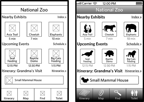
A higher-fidelity version of the first wireframe in this chapter may introduce some rounded corners, some little icons, and some gradients, to evoke a genuine iPhone interface. Figure 7.12 shows what this might look like.
Figure 7.12. High-fidelity wireframes introduce some aesthetic elements. In this case, making the basic screen from the National Zoo app look more like a native iPhone user interface can help facilitate buy-in. With a gradient and rounded corner here and a clipart icon there, you have something higher fidelity.
Styling wireframe components can be time-consuming and depends heavily on the diagramming program you use. Some applications (such as Adobe Illustrator) give you lots of control over the style of the drawing objects. Others (OmniGraffle, MS Visio) give you fewer stylistic options.
But the decision to emulate the final design rests on other factors beyond the technical:
• Purpose: How does creating a realistic-looking web page contribute to the purpose? Some purposes (kicking around a new UI concept, for example) don’t require such a close adherence to a final web design. Others (using wireframes for usability testing) would benefit from a more realistic rendering. The most typical usage of wireframes (documenting behaviors) likely won’t need much in the way of style.
• Consumers: Who is the ultimate audience for wireframes, and how will they benefit from high- or low-fidelity wireframes? Lo-fi wireframes may seem inaccessible to inexperienced project participants. The flip side is that wireframes with too much style thrown in set expectations about the final design, a position the team might not be ready to take.
• Project context: Fidelity depends a lot on the nature of the project. Designing a brand new product within a large project team may benefit from the deliberate approach of a lo-fi wireframes: emphasizing a focus on functionality before getting to visual design. When repurposing existing components within a well-baked design system, there may be no reason not to use hi-fi wireframes.
Abstraction: How specific is the content
The content in the wireframe in Figure 7.11 has low abstraction: It uses realistic content, if not entirely accurate content. The content is specific and concrete. Readers of the diagram may ultimately struggle to understand how the template is generalized to other content, but the purpose of the page is made clear through the content samples.
Figure 7.13 shows the same wireframe but more abstracted: The structural content remains intact, but much of the content is replaced with text that is less specific and more representational.
Figure 7.13. Abstracted content in a wireframe means swapping out concrete information with text that’s more representational. Note the use of three different forms of sample content: labels (with brackets), symbolic (representing the time, number of reviews, and the dates), and Latin text (for the itinerary descriptions).
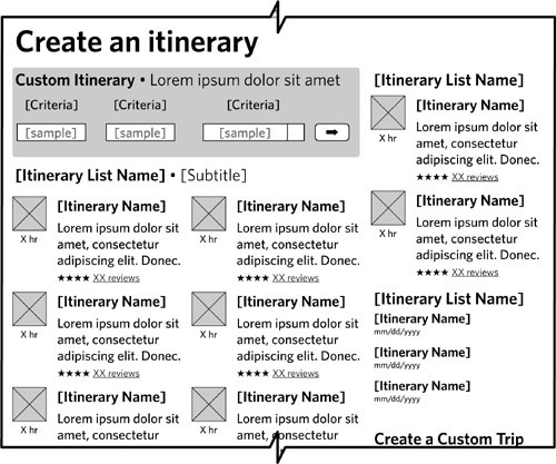
A more abstract wireframe can be difficult to visualize, but it does a better job in describing the functionality, behaviors, and states. It gives you a clear picture of which content on the screen is dynamic and which text is fixed. Abstracted content in wireframes is appropriate for functional specifications, when you need to explain a range of behaviors. More concrete content is better earlier in the design process, when you’re trying to help the project team visualize the interactions.
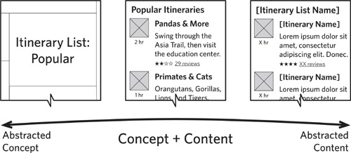
Figure 7.14. Abstracting wireframes can go in two directions. Abstracting the concept means taking out any sense of internal structure, but being relatively specific about the topic or focus of the content found there (left side of scale). Stripping out any real content but preserving the structure gives you a sense of the kinds of information (title, image, etc.) but no clear focus.
Depth: How many variations
If the surface of wireframing represents the barest minimum you can do to communicate the user experience, digging below it means elaborating to describe every last detail. The surface describes what happens in a typical scenario, and digging deeper reveals details about additional scenarios. The surface gives me the primary screens, and the deeper I go the more information I get about:
• Secondary screens: Screens that are not essential for understanding the user experience (a login, for example) but which need to be defined or the product will fail.
• Variations at the page level: How the pages might change in different circumstances. For a search results page, variations might reflect the quantity of results returned. Does the page look different with 1,000, 100, 10, or 1 result?
• Variations at the component level: How a portion of the screen might change in different scenarios. A global navigation element might look different when users are or are not logged in. A form element might change when users commit an error.
Purpose
The four dimensions (scale, fidelity, abstraction, depth) give you a sense of the range of decisions you can make about the wireframes themselves. Unlike other diagrams, wireframes have a pretty concrete range. These four dimensions give us a lot to play with, and it’s important to understand them before talking about the inputs into those decisions.
The main input into how to fine-tune your wireframes along these dimensions is purpose: What are you using the wireframes for? I usually come up with one of two answers:
• Blueprints: Document detailed functional specifications. The wireframes are meant to give developers every last detail they need to build the web site. The diagrams work hand-in-hand with annotations to elaborate on business logic, editorial guidelines, state descriptions, and behaviors.
• Concept: Capture an overall design idea. You will use the wireframes to solicit feedback on an overall approach—either on technical feasibility or whether requirements are adequately addressed—or merely to see if it’s a good idea.
There is another purpose for which I might use wireframes: testing. My experience, for better or worse, is that I create a set of wireframes for blueprints or concept, and then the project team later decides to do some testing. We gravitate toward using the wireframes, a decision we ultimately regret because they weren’t created for testing purposes, so they need to be edited heavily for that reason, adding realistic content, creating separate screens to address each scenario in the test, and linking all the screens together.
Audience
To be clear, when we talk about the audience for wireframes, we’re talking about the people who need to use the diagrams, not (usually) the users of the web site you’re designing.
Assessing the target audience for the wireframes means more than just understanding their roles on the project: Different people may be more or less comfortable with the inherently abstract nature of wireframes.
Tips for Wicked Wireframes
Effective wireframing depends on a little careful planning and preparation. You could write down a few lists or spend a few hours sketching ideas, but either way, don’t start inside your diagramming application. Find a quiet spot with a pen and notebook and consider these tips.
Sketch first
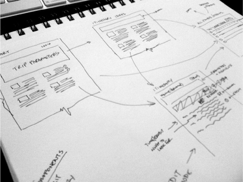
It may seem obvious to start with a pen and paper, but a lot of web designers I know like to go right into a drawing application. Sketching out some initial ideas can help set direction and give you a starting point before firing up the application.
How much should you sketch? Different people do this differently, and as the technique goes through a bit of a renaissance in the web design business we get to see lots of different techniques. Here’s what works for me:
For each iteration, I sketch as little as possible, but I do as many iterations as it takes.
For me, the point of sketching is to make sure I establish the basic framework for the page, solving the essential design problem. I’ll do multiple iterations to explore different approaches, but I don’t need to do a lot in each sketch to establish an approach. For me, sketching is about quantity, not about quality. It’s a means to generate and evaluate ideas. I may do a few iterations on a single approach to hash out a few of the details, but I tend to save the heavy lifting on the details for the wireframes.
Figure 7.15. Sketching with pen and paper is an important step in the wireframing process.
Establish a purpose for the page
Before even sketching a page, I ask myself, “What is the one thing this screen has to do?” Establishing a central focus can help drive the design decisions you make about the page, especially with respect to prioritization.
While the entire project constitutes a large design problem, each page is a small design problem in and of itself. There’s no reason why a good practice (defining a vision) can’t scale downward. You could do this at the component level, too. (Of course, the smaller you get, the easier it is to define a purpose.)
Recall design principles
If your project entailed some discovery work at the beginning, you likely have a design brief with a fundamental direction and design principles. I like to recapitulate these in the margin of my sketchbook before I dig too deeply into a screen design. The mere act of writing them down again keeps them fresh in my mind and triggers good ideas in the part of my brain that designs web pages.
List page contents
If it wasn’t clear from the Anatomy section, wireframes can be boiled down to a list of things on the page. Even if you can’t turn in a list as your final deliverable, you can use it as a starting point. In addition to putting design principles in the margin of my sketchbook, I also make a list of everything I want to put on the page. Some things get circled as the most important things to include. For especially complex components, I’ll create sublists to describe the priorities within a particular content area.
Use realistic scenarios
In the Zoo example, the companion web site includes a page that lists different itineraries, the List Template. This template is used in several different scenarios: when users conduct a search for a specific itinerary, when users provide a set of criteria for designing an itinerary, when users look at a list of their saved itineraries, or when users click a link that says “see more” or “see all.” This List Template needs to do a lot.
It may be tempting to show the “every case” scenario. That is, all the possible configurations for the template in one wireframe. While this may seem useful, it can undermine the project team’s understanding of the screen. The “every case” scenario may show all the possible elements, but it doesn’t successfully convey appropriate behaviors.
Your wireframe should depict a single, realistic scenario (and the annotations should be clear about that scenario). If the template has several dramatic variations because it supports multiple scenarios, you should create a separate wireframe for each.
For example, the Zoo’s List Template would use different components at the top of the page depending on how users got there. It might list search criteria, or it might display a toolbar for managing my saved itineraries. Instead of displaying both components (the “every case” scenario) in one wireframe, the document should include two versions of the wireframe.
Level-Up Your Wireframing Skills
The power and flexibility of wireframes affords countless opportunities to improve upon them, as well as our techniques for creating them. Here are a few we’ve been playing with.
Take a modular approach
With a modular approach, you treat wireframes as Lego kits, assembling screens from individual, shareable pieces. Creating wireframes means designing the individual pieces and then designing the page frameworks for those components. The components snap together in the context of a page template.
Headers and footers are common components. Navigation elements are common components. You can create a common component for interfaces that display particular kinds of content (videos, for example).
Thinking in these terms may be challenging if you’re used to a more holistic approach to design. As you embark on your own journey to take a more modular approach, keep these tips in mind for your documentation:
• Components won’t make sense if people don’t understand the larger context. Lego manuals always start with a picture of the whole model, and your documentation needs to establish context by showing the components in action. Once the project team understands the context, they can have more meaningful conversations about how the component works elsewhere, or how a variation on the component might work in the same context.
• Components require a rigorous identification system. A web site consisting of half a dozen templates may rely on ten times as many components. Careful encoding of the components helps people using the library keep them straight, and ensure they’re using the right one.
• Components have particular functions and are likely meant for particular page regions. In chapters 8 and 9 of Modular Web Design, Nathan Curtis describes how teams can break down page templates and classify components corresponding to typical page areas and features on a web site.
For example, the itinerary description shown in Figure 7.18 is used throughout the web site to summarize an itinerary.
Figure 7.18. This is a component, reusable throughout the web site. The content is just placeholder content, which I’d have to swap if I put the same component on a single page multiple times. Alternatively, I could replace the sample content with variables, like “[Itinerary Name]”.

Establish styles
To ensure consistent use of typography, create a set of simple styles (like you might in a word processor) so that all your headers, all your body text, all your links, and all the other text elements are formatted in the same way.
If your wireframe makes use of other elements to communicate priority (like shaded rectangles), you can create styles for these shapes as well. Create a rectangle, select the “background field” style, and you can be sure that every background field in your document is formatted in the same way. (Even I forget to do this sometimes and find myself wondering, “Did I use a 4px rounded corner or a 6px rounded corner?” That gets me distracted because then I start thinking, “It’s a wireframe! Who cares?” And THEN I start thinking, “They might not know, but I’ll know, and then I won’t be able to sleep.” In short, styles prevent neuroses.)
Tip: Yahoo! Design Pattern Library
The Yahoo! Developer Network includes a library of design patterns that correspond to typical user interface elements like tags or navigation or information displays. It’s a great starting point for establishing your own library.
http://developer.yahoo.com/ypatterns/
Another library, the Yahoo! Developer Network YUI Library, contains code snippets for typical interface controls like tabs and carousels. This repository is more about the code than it is about the specific design of these elements.
Different drawing applications offer varying levels of support for styles. Most offer some way to store a set of style options and are generally sufficient for our wireframing needs. Learn your preferred tool backward and forward so you can take full advantage of its capabilities, ensuring that you become an efficient and consistent wireframing machine.
Create a library of elements
Most diagramming programs allow you to store shapes in a stencil or library. (Every application calls this feature by a different name. Of course.) Rapid and consistent wireframing depends on using the same set of elements. These can range from individual form elements to more elaborate configurations like a navigation bar or a set of common search fields or resizable image placeholders.
Lest you see these libraries as constraining, a few reminders:
• Elements in a library are starting points. Lists of headlines don’t vary that much from one to the next, so having a standard format provides a quick and easy way to drop it into the wireframe.
• Elements are tried-and-true design conventions. Your value is not in reinventing a drop-down menu, but in how you use those elements to solve specific design problems.
• The purpose of a wireframe is to convey functionality as quickly as possible. By incorporating a library into your design process, you can create new screen designs efficiently.
Hold a design studio
If you’re keen to take your sketching up a notch, consider a more collaborative approach. Design studios bring together the project team and engage them in a series of sketching exercises. This technique was introduced to me and my firm by Todd Zaki Warfel of messagefirst. It’s a variation on well-established collaborative design techniques.
• Outcomes: Sketching studios generally last a full day, and at the end you’ll have a stack of ideas to draw from. Studios definitely emphasize quantity over quality, but by bringing together a range of disciplines (not just designers) with varying perspectives on the project, you’re bound to see a new idea or approach.
• Structure: In a design studio, participants break up into multidisciplinary teams. Throughout the day, the team creates sketches for two to four different scenarios. The studio facilitators describe the scenario and provide sufficient inputs (like descriptions of the target audience). Members of each team sketch different ideas, spend time discussing the ideas, pick a direction, and then do another round of sketching where they work together to create a single concept from their brainstorming.
• Preparation: As studio facilitator, you are responsible for a few things. You need to prepare the scenarios. This depends on having an intimate understanding of the design problem. Scenarios are most successful when they are specific, stating the user’s situation and desired outcome.
How do sketching studios factor into design documentation?
• Sketching = setting expectations. By getting people to create sketches, they have a better understanding of the kinds of artifacts you will produce.
• Scenarios = understanding context. After people have thought through the scenarios to create their own designs, they will have a more intimate understanding of the context for the design concepts you present.
• Collaboration = buy-in. Participation in the design process creates a sense of ownership. Even if you don’t use someone’s idea, they will have been part of the process to explore design concepts and evaluate different approaches.
One nice side-effect of holding design studios at the beginning of the design process is the acculturation of the design team to reviewing screen concepts. When it comes time to review wireframes, they’ll at least have some exposure to the process. Regardless of their experience, the next section provides some suggestions on how to present wireframes to the project team.
Presenting Wireframes
“Presenting” may not be the right word. Because wireframes are perhaps the most tangible design artifact, they generate more conversation than any other diagram, and become a tool for collaboration on the design. Still, you’re on the hook to facilitate those conversations, and that’s the position the remainder of this section takes.
Establish a Purpose
The purpose of any wireframe review meeting is to discuss the user experience. If you’re doing these diagrams more or less in the order described in this book, wireframes will be the first venture into a concrete view of the system. Depending on your process, wireframes will merit multiple discussions, and the tenor of those discussions will change as the design progresses from initial concept to detailed functional specifications.
Pitching a concept
Wireframes are fast, they are reasonably approximate, and they are meaningful pictures of user interfaces. They make, therefore, excellent tools for pitching a design direction.
In meetings where you’re laying out the overall concept, you may have a small number of wireframes, just enough to provide a sense of how people will interact with the system. Your messages are straightforward:
• Alignment: Your wireframes should clearly trace back to the stated design problem. They should resonate with any design principles established earlier in the project, conform to requirements, and respect identified constraints and boundaries.
• Complexity: In telling the story behind the experience, a small number of wireframes, perhaps focused on the main parts of the user interface, may belie tremendous complexity under the surface. Your presentation needs to be honest about the challenges implied by your vision.
• Remaining: Eager project teams may latch onto the direction and think they can start building. (Heck, I make this mistake with greater frequency than I care to admit. My passion gets the better of my good judgment.) Your pitch meeting should come with at least a high-level plan describing what remains to be done; these initial concept screens are a good starting point, but more must be said before coding begins.
Wireframes make great sales tools. Even those lacking polish evoke the user experience in ways flowcharts and other diagrams can’t.
Discussing the experience at a high level
The same set of wireframes you use for pitching a concept may be used to hash out the experience. In this meeting, you’re evaluating the design against the established objectives, requirements, and constraints. You need to answer at least these questions:
• Does this approach address all the objectives? Use this meeting to solicit other pairs of eyes to compare the design approach to the documented objectives. For example, the objective of the web-based itinerary picker may be to encourage people to use the iPhone app, where the Zoo generates revenue through the cost in the iTunes app store. One criticism of the itinerary web site is that it doesn’t do a good job in promoting the iPhone app, encouraging people to use and download it.
• Does the approach conform to design principles and good design practices? Looking at my itinerary wireframes after leaving them for a couple days, they seem really dense to me. This may be OK, but raising it in a review meeting, I would ask whether the approach aligns with the project’s design principles or current trends in web design.
• Do we need to reevaluate the requirements? Seeing designs in the flesh may shed light on the design problem or the requirements in ways you could not conceive before having screens in front of you. The designer may have come up with an idea not reflected in the requirements (in the iPhone app, stating the user’s distance from another exhibit in terms of minutes, for example).
• What’s implied by this screen? Careful examinations of screen designs reveal new requirements through dependencies. In order to support the itinerary picker, for example, the team needs to create business rules for generating an itinerary based on the inputs. While these concepts may have been identified in the requirements, the design makes them real, and the exact implications become clear.
These questions help the design team generate another version of the wireframes, refining the functionality based on these findings. At some point, however, in some processes, these conversations are not enough. The design team needs to dig in deeper to make sure they’ve dotted all the i’s and crossed all the t’s before turning the functional specification over to the development team.
Some teams stop wireframing here. Their processes allow for half-baked wireframes to serve as the catalyst for further design and development. For some projects, their scale, the configuration of the project team, the design culture, and other factors make multiple iterations of wireframes pointless.
Discussing the experience at a deep level
A deeper discussion ultimately boils down to stress-testing the design concept to see if it can handle the rigors of production. Such reviews get mind-numbingly detailed, and you get to learn who on the project team has the severest case of mild obsessive-compulsive disorder. Here are just a handful of deep-level questions the team might explore during such a conversation:
• Have we addressed all possible scenarios? A scenario establishes a set of conditions that affect the display of particular screens, and a good design anticipates all the possible scenarios. This is a multidisciplinary task. User experience designers can imagine all the weird scenarios created by usage, but only people responsible for technology and operations can anticipate a full range of unusual scenarios. (“What if database X is down but database Y is still running? What if there’s no one available to answer a customer service call?”)
• Does the team have enough information to render a visual design? Playing through all the scenarios may mean generating additional wireframes to show the full range of displays. Visual designers work in pixels, which affords much less flexibility in laying out a screen. They need a clear understanding of the range of possible displays so they can design a user interface that supports the functionality without breaking.
• What content is needed in the interface? Combing through the interface will reveal the full range of messaging and content it requires. Someone will need to generate final labels for navigation, instructional text, field labels, hints for completing forms, error messaging, confirmation messaging, and page titles, not to mention all the actual content on the site.
The truth is, you could do these kinds of reviews forever, spelling out the user experience in ever-increasing detail. How much is enough? In some cases, these deadlines are spelled out for you: A good project plan should establish constraints on when to transition between phases in the design process. If you’re struggling to conform to a particular schedule, here are some warning signs that you’re spending too much time reviewing detailed wireframes:
• A wireframe has gone through more than three revisions. This number may be five on especially complex systems, but look at the revisions on a single wireframe. Long revision histories generally point to unstable objectives or requirements, which means there’s a deeper problem on the project.
• You’ve reversed a decision more than once. Let’s use a drop-down. No, let’s use a slider. Hmm, let’s go back to a drop-down. Time to move on.
• Key stakeholders no longer come to review meetings.
• You can’t get through a full review in less than an hour. After the first or second detailed review (which may take more than an hour), subsequent reviews should be relatively fast, nailing down specific questions or issues.
Some of these are, frankly, somewhat arbitrary measures of doneness. Spinning on a wireframe generally points to instability or lack of clarity elsewhere in the project, but don’t let the wireframes become an excuse for not moving forward.
Adapt the Presentation
Running a wireframes meeting should be the same as discussing any other design diagram. The overall framework for these conversations—starting with the big idea and rationale, followed by details and implications—works well for all wireframe reviews. Regardless of whether you’re talking about the user experience at a high level or in painstaking detail, starting with a lay of the land and major themes helps keep the conversation focused.
1. Establish context
Establishing context at the beginning of any design review means reminding the project team of where you are in the project and providing objectives for the conversation. For wireframe review meetings, you will also need to remind people about which screens you are reviewing today and what scenarios they belong to.
2. Describe visual conventions
For project teams who aren’t used to looking at wireframes, provide a short introduction to the format. You can also use the whiteboard to make two lists: what you will and will not discuss as part of the wireframes.
During this portion of the meeting, you can also explain your decisions regarding scale, fidelity, abstraction, and depth. Helping meeting participants understand where the wireframes fall in each scale can also set their expectations about what they will and will not see. Note that you should use plain language to describe the wireframes; words like “scale” and “fidelity” won’t mean much if people in the meeting haven’t had much experience with wireframes.
Figure 7.19. Setting expectations about wireframes at the start of the meeting can help head off difficult conversations.

3. Highlight major design decisions
Before digging into the details of the wireframes, you can walk through them quickly. During the quick walkthrough, you can touch on:
• Overall themes: How would you characterize the major design decisions? What were the driving concepts behind most of the design ideas?
• Key objectives, principles, or requirements: What were the objectives and principles that were top-of-mind during the design process? What are the main requirements this design addresses?
• Page purposes: In designing the page, what was the central purpose you established for it?
• Important design innovations: What are the coolest parts of the design? What design decisions are you most proud of?
There’s a lot of information listed here. Err on the side of brevity: The intent is to provide an overview, not an in-depth discussion. This section can be even more brief on subsequent reviews, and should instead summarize the main changes since the last conversation.
4. Offer rationale and identify constraints
You can use this portion of the meeting to highlight the significant challenges you encountered during the design of these screens.
If any design principles played a major role in driving design decisions for this particular set of screens, you can reiterate (and even capture on the whiteboard) these concepts.
5. Point out details
When it’s time to dig into the details of the wireframe, use the approach in Table 7.6 as a starting point for structuring your discussion.
Table 7.6. Digging into details, how to structure your approach.
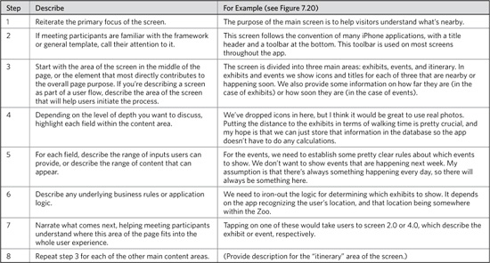
If you need a simpler framework to walk through the screen, consider this mnemonic: APU, area-principle-users. Focus on the area and describe its function. “Zoom out” and describe the principle, objective, or requirements that this area relates to, then zoom back in and walk meeting participants through the area as users might experience it.
6. Communicate implications
Any design decision captured in a wireframe will come with cascading implications. As described in the general approach, these implications can be technical (how will we build this?) or operational (how will we support it?). Functionality can be deceptively simple, requiring substantially more development or support than appearances would suggest.
Prior to the meeting, make a note on the wireframe where you suspect the most severe implications. Make a note of the most important functionality. During this portion of the conversation, ask participants to pay close attention to both of these. For suspected complex functions, you’re confirming your suspicions and asking the experts to ensure that they account for the potential challenges. For the most important areas of the design, your intent is to validate the approach so you don’t have to compromise the design later.
7. Solicit feedback
Contributions to wireframe reviews really run the gamut; sometimes participants can’t stop talking (see “Avoid Newbie Mistakes,” later) and sometimes they just don’t say anything.
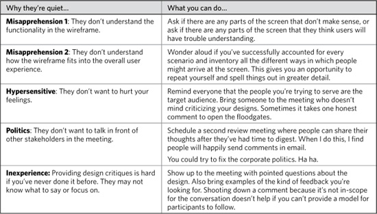
Don’t take silence for complacency, agreement, or buy-in. There are a few different reasons why stakeholders don’t jump in with comments, listed and mitigated in Table 7.7. Avoid “testing” meeting participants. Nothing discourages productive discussion like being made to feel like an idiot. Deflect any potential hurt feelings by bringing the user into the conversation.
Figure 7.20. Refer to this figure for descriptions in Table 7.6.
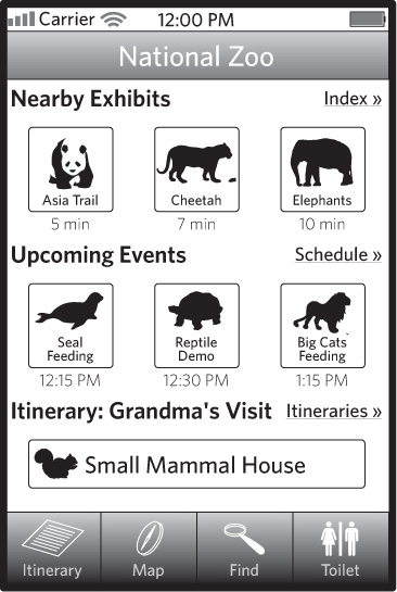
Table 7.7. Dealing with quiet meetings requires sensitivity to diagnose why people might be afraid to speak up.
8. Provide a framework for review
Inevitably, the depth and complexity of the design documentation in wireframes makes it difficult for all the details to be hashed out in a meeting. Giving stakeholders homework (and this is true for asking people to review the wireframes before a review meeting, too) requires specificity on what needs reviewing and what kind of feedback you want.
Typically, there are five things that you want from the project team:
• Alignment with objectives: What’s missing from this wireframe that prevents it from meeting the project objectives?
• Usability issues: What parts of the interface design would users find most challenging?
• Content and priority issues: Is there anything wrong with the content as rendered or the relative priorities?
• Functional issues: What happens to fields A, B, and C in scenario X?
• Feasibility: What part of this design will be the hardest to implement, and why?
(Notice how I avoid yes/no questions, to prevent tacit assent?) To the extent you can ask these questions specifically and pointedly, you should embed them directly in the annotations for the wireframe. That is, open questions should be captured and highlighted in the documentation itself.
Avoid Newbie Mistakes
In this section, “newbie” might be the wrong word for the title. The mistakes outlined in the next few sections are made on every project by the most experienced designers. Ultimately, this part of the design discussion—somewhere between abstract and concrete, between problem and solution—is the hardest.
This section presumes that wireframing and graphic design are separate endeavors. In many web design practices, finalized wireframes are turned over to visual designers, who then interpret the structure and create a final user interface, incorporating other inputs (like a brand strategy). Likewise, the team may include people dedicated to writing content. It assumes that those content strategists will have deliverables over and above the wireframes.
None of the following tips matter if the right people aren’t a part of the conversation from the outset. Getting them engaged is important, too. A developer sitting at the table even from the very beginning of the design process does you no good if he or she doesn’t take the role seriously and provide substantial input into the design.
Set expectations about the purpose
In the context portion of the meeting (step 1), clearly state what you want to get out of the meeting. The rabbit holes described next don’t make themselves: They come from a lack of focus, and a lack of facilitation.
As part of setting up the purpose of the meeting, you can call out the questions you need answered. Using the questions to frame the meeting helps establish the tone and focus at the outset.
With any rabbit hole, there are a few positions you can take:
• Not discussing: “This is out of scope for this meeting, and I need to get answers to these questions or we can’t move forward with the design effort.”
• Table for later: “These are really good points, but out of scope for this meeting. Let’s capture them so we can discuss them later.”
• Let’s hash it out (with consequences): “I don’t mind spending time talking about this stuff, but we’re going to lose ground on the wireframes. We may need to schedule another meeting, or I need to get feedback via email.”
Getting back on track for any meeting is challenging, and often means you have to play the bad guy. While being a stickler for meeting agendas isn’t the worst crime in the world, it can be frustrating for team members who see something more pressing.
Wireframes contain content and graphic design elements out of necessity, even if they’re not trying to put a stake in the ground for either. Reacting to and discussing priorities and structure is difficult in the abstract. But the concession we make with wireframes to help people understand them (or even to solicit this kind of feedback on purpose) means risking conversations that diverge from the matter at hand.
The content rabbit hole
Even with a well-defined purpose, wireframe discussions can quickly lose focus. The primary culprit is meeting participants reacting to elements of the wireframe that are not really in question. Words (meaning structural, instructional, and sample content) is (a) something easy to react to and (b) something everyone has an opinion about.
Establish at the beginning of the meeting which content in the wireframes is in scope for discussion. You may have incorporated some real sample content to give people a realistic view of the page, but don’t feel the need to dig into it.
Structural content (headers and navigation) and instructional content (field labels, error messages) may be in-scope. This may be a more challenging conversation to moderate: You may be more interested in addressing the tone and message of the content without digging into the exact words.
Should content ever be out of scope? Can you legitimately talk about a wireframe without talking about its content? A more nuanced view of what content is (there are different types and every wireframe reflects all of them to a greater or lesser extent) yields, perhaps, a less absolute position. Some content is always in-scope for a wireframes discussion.
The visual design rabbit hole
Wireframes are inherently visual, just like they have words. Both are generally unavoidable. In some ways, visual design is a more challenging distraction because it’s difficult to reassure people that the things they’re concerned about won’t have an impact on the final design. People who raise issues about spacing or type size or whitespace have legitimate concerns—wireframes are just not the right place to work them out.
Structure, aesthetic, voice: Managing the overlap
If you take off your web design hat for a second and look at wireframes again, it seems weird to separate three things that make up experience. These elements—structure, visual style, and voice—are experienced as one.
One mistake you can make is to keep looking at them in separate and distinct silos. Your job as a designer is to shape the whole experience, and the nature of our medium means that sometimes you have to do that a little bit at a time.
Whether you bring this up explicitly in your conversations or not, do not forget to take a moment to think about the wireframes as a skeleton needing flesh and more to make it a true living product.
Dismissing feedback and getting defensive
Do not, under any circumstances, undermine the feedback provided by meeting participants. Establishing yourself as someone unwilling to discuss design ideas positions you as an obstacle. The organization will learn to route around you, cutting you out from subsequent design activities. I’ve seen this happen.
People don’t mind being wrong, but they want their voice heard. Your role as a designer is to help them find that voice, discuss the ideas, and zero-in on something good. Your role is to help other people provide good feedback on design, to become better critics and to be productive members of the design team.
That said, making every design decision through committee debate or democratic voting misses the point of discussion. Design decisions need rationale, clarity, and alignment with a vision. Therefore design decisions should be driven by:
• A singular vision, hopefully held by a manager or director on the project, who is empowered to enforce that vision.
• A set of standards, established through testing and validation.
• Meaningful, relevant, and appropriate testing procedures.
Productive design conversations happen in cultures where at least one of these things holds true. The discussion becomes unproductive when designers rely on their “expertise” as the sole rationale for the design decision. Such environments are ripe for breeding defensiveness and arrogance. If you find yourself bumping up against other people who “just don’t get design,” take the responsibility to educate them, helping them contribute to the discussion. This is the only way to create design-friendly corporate cultures.
Applying and Using Wireframes
Wireframes’ use does not end with creating and discussing them. Their value extends beyond realizing design ideas and facilitating conversations about user experience. You can employ them throughout the design process to elaborate on concepts, provide direction to downstream activities, and even as a vehicle for testing. Before you get to any of that stuff, though, get good at annotating wireframes: adding adjacent text to explain its behavior.
Annotating Wireframes
Like any other diagram in this book, wireframes cannot stand on their own. Though less abstract than a concept model, more tangible than a flowchart, and more specific to design than personas, wireframes are still representations. Wireframes, especially those rendered on paper, cannot capture the detailed behaviors and functions of an interface. Annotations help bridge that gap.
While there are many ways to annotate a wireframe, the tried and true method is using markers to point out important parts of the wireframe, and elaborating on details in notes on the side.
Figure 7.21. Tried and true wireframe annotations entail a number, a pointer, and a note.
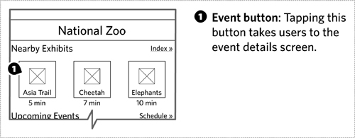
In some cases, it’s worthwhile to use a larger field to highlight an area of the wireframe. Even though you might have conceived of the wireframe as having specific content areas, these distinctions may be lost once the wireframe becomes more detailed. Your annotations may also only refer to a small piece of a content area, or they may refer to multiple content areas.
Figure 7.22. Delineate particular regions of the wireframe for your annotation using a larger semitransparent field,
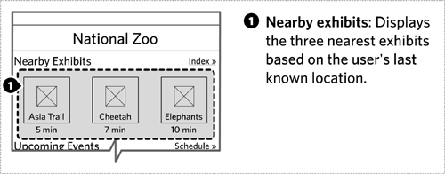
Of course, the complexity of your wireframes could warrant some combination of these two approaches. One way to do this is to first annotate the large regions, then create separate pages in the document to annotate each component. Figure 7.23 shows what this might look like.
Figure 7.23. When simple annotations aren’t enough, you may have to break up the wireframe to provide the right level of detail.
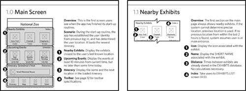
A modular approach works well here, giving you room to annotate the details of each component.
Wireframes themselves can vary along four dimensions (scale, abstraction, depth, and fidelity). Likewise, annotations may be measured by “weight,” which refers to the level of detail. Light annotations are those that provide a description of the screen’s functionality and behavior without digging into the details. Light annotations gloss over the various scenarios and don’t provide a comprehensive view of all the different states a wireframe may display. Heavier annotations provide increasing levels of detail, to the point that they constitute functional specifications sufficient for driving development.
While you can drive the weight of your annotations, final assessment is up to the people responsible for building the site. The development team may require additional levels of detail, even if you feel you’ve provided heavy annotations.
There are four topics that should drive your annotations: overview, behaviors, content rules, and states.
Overview
A blurb describing the purpose and objective of the wireframe helps set context. Use the overview to boil the wireframe down into a single sentence.
But the overview can be more than just a single sentence, providing further context with some additional fields:
• “Use when” and “don’t use when” instructions: As our design processes become more modular, our outputs become more about providing a set of Lego bricks that can be used in many different instances. Providing usage guidelines can help in subsequent efforts to determine whether a page template or a component can and should be used in different circumstances. For example, the itinerary long description component might specify that it should be used when displaying unfamiliar itineraries. It might specify that they should not be used in a sidebar itinerary list.
• Scenario: Describe the user’s situation when looking at this particular screen. If the screen addresses multiple situations, spelling them out will help the development team. Focus on the portion of the scenario that sets context for the screen or could affect the display: log-in, user role, and where the user came from.
• See also: While maintaining references in a deliverable can be challenging, especially complex experiences may be difficult to document all on one page.
Behaviors
Annotations that describe how the interface changes in response to user inputs describe that screen’s “behaviors.” Consider these behaviors:
• Links: The simplest behavior annotation answers the question, “Where do people go when they click on this link?” The answer is generally a reference to another wireframe, or to some other page on the site.
• Form elements: Fields in a form require annotations to help people understand what is and is not allowed in the field. Text boxes may be annotated to indicate character length or validation criteria. Drop-down menus may be annotated to capture the full range of choices.
• Form submissions: Like links, these annotations answer the question, “What happens when people submit this form?”
• Transitions: With front-end technologies allowing more complex interactions, annotations sometimes have to explain transitions. For example, hovering over an itinerary produces a balloon with additional information. How quickly does the balloon appear? Does it just appear, or does it animate in? How long does it stay on the screen? If in scope for the wireframe, its associated annotations can answer these questions.
• Other rules: Some rules are specific to the particular interface. For example, in the itinerary picker, describing the behavior and states of the slider for choosing the size of the group may require rules not easily categorized elsewhere. (Does the slider move smoothly or “click into place?” How many different settings are there? Does each setting have a unique icon and label?)
Content rules
Back to basics: Wireframes define content areas in templates. Those content areas will contain similar kinds of information, but not necessarily the same information every time the site renders the page. Rules about content should describe the criteria used to select content for a particular area of the site, and provide some suggestions on the kinds of information displayed for the content. Some criteria you might use to specify rules about content:
• Recentness: From what time period should the system draw content?
• Quantity: How many pieces of content can be displayed?
• Type: Should content be specified from a particular type?
• Topic: Should content be marked with a particular set of keywords?
• Other metadata: Is this content from a particular author? Or, if a product, of a particular price range?
• Usage and popularity: Should the content be drawn from among the most trafficked?
• Default: If nothing matches the criteria you specify, what should be displayed?
Some of these criteria are more loaded than others. Usage and popularity depends on the site’s tracking of that information. If the infrastructure has no means for capturing and interpreting usage information, it can’t be a criteria for choosing content.
If your wireframe doesn’t already specify the format for displaying the content, you may need to be specific about what information gets displayed. For small lists of recommended products on an e-commerce site, this might be nothing more than a thumbnail image, the name of the product, and the price. On the itinerary site, we might specify the associated image, the name of the itinerary, the short description, average user rating, and total number of reviews.
Your wireframe may contain more specific content areas, variables that specify different individual pieces of information. For example the account link at the top of the page that says “Hi, Dan!” might be specified in your wireframe as “Hi, [Firstname]!” While the content rule may seem self-evident, use an annotation to specify additional information like:
• Source: Where is this information drawn from? Is there a particular database or particular field in the user database?
• Format: Any special rules about formatting the information? (For example, always render this with a capital letter first, regardless of what’s in the database.)
• Default: What does this look like if there is no information? (For example, maybe this whole statement changes to “Need to update your account info?”)
Figure 7.24. Content rules for a specific variable help developers know exactly where to draw the information from.

States
If an area of the page appears differently in different circumstances, this is called a “state.” A state is a scenario affecting the display of the page or the component. Like content rules, states are based on a set of criteria, but these vary based on the specifics of the application. Unlike content rules, a page or component has a discrete set of states, and they’re usually named based on the circumstance or summarizing the effect on the design. A form, for example, may have three states—blank, prefilled, or error.
From a documentation perspective, you may need to create a wireframe for each state, especially if the differences between them are dramatic. At the component level, putting all its different states on one page in the document helps people compare the variations and understand the circumstances that drive them.
When documenting states for pages, it can be challenging to spell out the differences between them all on one page. In this case, include an overview page dedicated to highlighting the circumstances of each state, and then dig into the details of each screen on subsequent pages.
Connecting Wireframes to Other Deliverables
Wireframes are powerful because they can describe the user experience in great detail. But reviewing wireframes (especially when you aren’t their author) can be challenging because they often appear out of order or out of context. Readers don’t get a great sense of the flow, of the more subtle interactions, or how the wireframe might deal with different situations.
The Flowcharts chapter discussed wireflows, one technique for integrating wireframes with that diagram. Here are some other ideas on building a bridge between wireframes and other diagrams.
Providing context for pages
To understand a wireframe means understanding where it fits into the overall user experience. Site maps and flowcharts can help provide context for the wireframe, showing how it relates to other pages or templates in the site.
Some tips:
• Zoom in on the appropriate portion, especially if the flow or site map is too big to be recognizable when shrunk. When talking about a flow, I may even remove everything except what comes immediately before and what comes after.
• Strip most or all formatting from the structure. You may have used various colors and line weights to differentiate nodes on the site map, but those will just be distracting at a small scale. Use only the barest minimum to ensure the structure is still recognizable.
• Highlight the relevant page in the structure. Use a dark color to mark which page you’re talking about, even if you’ve focused on just a handful of pages in the structure.
Figure 7.25. Flowcharts appearing alongside wireframes can help people understand how the screen fits into the overall experience.

Providing context for components
The context for a component is a page; components fit into pages like pages fit into structures. Show where components fit into the site by incorporating a small thumbnail of the relevant page and highlighting the component. In most cases, you can use a small version of the actual wireframe, as in Figure 7.26.
If components may be used across different templates, you can use a small version of a generic page layout. The generic page layout shows the structure of the page in terms of regions, highlighting the appropriate region where the component might fit.
Prototyping and Usability Testing with Wireframes
Though the thrust of this chapter is using wireframes as diagrams to describe priority and functionality, wireframes can serve as the basis for something more interactive. Rather than describing the behaviors and flows, you can demonstrate them by stitching together wireframes. Describing how is beyond the scope of this book, but Todd Zaki Warfel’s Prototyping: A Practitioner’s Guide (Rosenfeld Media, 2009) provides a great overview of different approaches to creating interactive prototypes. Meanwhile, I’ll leave you with some thoughts:
• Establish scenarios: Wireframes for documentation require a different treatment of scenarios than testing does. With documentation, you can simply acknowledge changes of state, but with a prototype you need to show them. Outline the scenarios you want to demonstrate at the outset, so you can anticipate the range of assets you’ll need to create.
• Select prototyping approach: Just because you create wireframes in a diagramming application like Visio or OmniGraffle doesn’t mean they can’t be turned into interactive prototypes. There are a number of ways to generate semifunctional demonstrations using PDFs, Flash, or slide-based applications like PowerPoint or Keynote. Each format comes with pros and cons, but understanding the capabilities of the selected tool will also help drive asset creation.
• Incorporate out-of-scope pages: Some pages may not be in-scope for the design effort, but may be necessary for demonstrating the new concept. The site’s home page or the log-in page, for example, may be dependencies in the user experience, but may not be part of the design effort. Establish a means for incorporating these pages in a way that doesn’t add unanticipated burden to the design team.
On-the-Fly Wireframes
Proficiency with your wireframing tool-of-choice can lead to some new and interesting techniques in designing screens. Combine that proficiency with an increased focus on collaborative design, and you might find yourself wireframing during the course of a meeting. Reacting to and incorporating design ideas on-the-fly can be a powerful technique for making design decisions efficiently and involving the entire project team. Rather than take notes on a design and then translate those notes into a new iteration, you’re creating the next version right then and there.
Figure 7.26. Providing context for a unique component, a thumbnail-size page wireframe shows where the component fits into the screen layout.
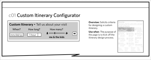
Figure 7.27. Providing context for a reusable component, a simplified thumbnail of the screen highlights which regions of the page are valid placements for the component.
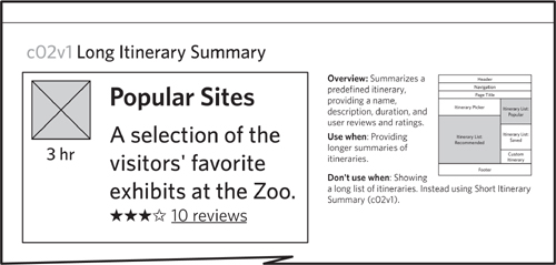
The main challenge with this approach is sacrificing your role as a designer for the production efforts. Don’t lose the thread of the design conversation, and don’t neglect your own contribution to the design conversation in favor of incorporating feedback from the assembled team.
Personally, I’ve seen this done successfully by only one person, my business partner Nathan Curtis.
Design in Black and White
The power of wireframes, in a nutshell, is the universal acceptance that we can sketch what goes on the screen with rectangles and lines. The ability to zero-in on the content and priorities of an information display is essential on every design project. When design teams ask the question, “What do users see on this screen,” they really want to know, “What do I see here?” Is a wireframe a tool for the ego? Maybe, maybe not. But a wireframe certainly is a dose of reassurance, a stake in the ground regarding What Goes Here.
Wireframes persist as a documentation tool because they are flexible. As diagrams describing content, behavior, and priority, they give us a lot of room to play with the exact presentation. Styles of wireframes emerge to suit the designer and design team. As the team becomes more cohesive, or the design system (the visual standards for the web site) becomes more mature, the wireframes can be more informal, simplifying the communication process. On the other hand, complex products, elaborate production processes, and other influences can keep wireframes highly formal. Neither extreme is better: that a diagram can occupy such a broad space is the value.
Modern production tools can make wireframes easy to produce, and there are many different approaches: vector artwork (Adobe Illustrator or Adobe InDesign), vector diagrams (Microsoft Visio or OmniGroup’s OmniGraffle), or embedded with a prototyping program (like Axure). Simple, portable formats offer a range of reuse. We’ve used wireframes as the starting point for Flash-based prototypes or clickable PDFs. The simplicity of the format allows designers to explore using other media, like HTML, to create wireframes. Combining wireframes, a historically flat diagram, with greater interactivity gives designers more opportunities to communicate complex behaviors. It provides tools to allow designers to test their concepts.
Wireframes are born out of the simplest way to represent a screen displaying interactive content: a bunch of rectangles. Stand up at a whiteboard or sit down with your sketchbook to diagram a screen and you will draw rectangles. The screen can take up a wall or fit into the palm of your hand, but they’re all rectangles, and their content may be similarly represented. Whether or not the display of information continues to exist in such devices, there’s a good chance that rectangles persist as the dominant form because of their simplicity.
Trends, however, suggest that screens will persist:
• Technological innovation is working to fit more information (higher resolution) on screens we can take with us. High-definition video, a novelty only 10 years ago, has become more pervasive.
• The screens themselves are becoming input devices as well as display devices. Any sophisticated phone you buy these days will be likely to have a touch screen.
• Innovation is going the other way, too, allowing us to put projectors in our pockets, so we can take over a wall with an information display anywhere we go.
When asked to design for any one of these devices, you’ll draw a rectangle.
What changes is the layer of information on top of these rectangles: their behaviors, state changes, and responses to our interactions. As new interactive gestures become available—whether people tap, click, wave, or talk to the display—the content itself remains trapped in rectangles.
But let’s say you can transcend the screen. Let’s say technological improvements allow for cheaper ubiquitous computing—computers are embedded everywhere. How do you describe a user interface when the information is conveyed with sound alone? When consumer products have complex interactions that don’t involve screens (like the refrigerator that can place your grocery order), how do you explain the interaction model? When the conveyance of information transcends screen-based devices or visual stimuli, it will be interesting to see whether or not designers develop a different method for representing information.
Wireframes are representations of screens, but ultimately they are about the kind of information presented and their relative priorities, as well as the range of behaviors available to users. Wireframes took on the form of our primary means for interacting with information (screens) and will evolve to accommodate other media. What we know of as a wireframe today may not look the same tomorrow, but its essence will persist. Ultimately, this tool (like any other design tool) is for illuminating the dark recesses of complexity, no matter what form it takes.
Exercises
- Reverse-engineer a wireframe by using a page from a favorite site and boxing out the content areas. This exercise works best with a large content site, but creating wireframes for other kinds of sites often yields interesting insights about the structure. Keep the practice wireframe very low fidelity, focusing on just carving out the important areas of the page and giving them meaningful labels. Add a layer of information by distinguishing different types of content areas: navigation, content, forms, and so on. Also distinguish between static and dynamic content areas, and reusable components. Eliminate any key identifying information from the site (its name, for example) and show your wireframe to a partner. Have them ask you all sorts of questions about the functionality, and see if they can guess the site it came from.
- Take your low-fidelity wireframe and create two higher-fidelity versions: one with lots of abstraction and one with no abstraction. That is, the first should have very little real content, using mostly variable names and other kinds of placeholders to demonstrate its flexibility and range. The second should be as concrete as possible, using real content from the original page. The fidelity should remain well short of a fully rendered page, but it should be something beyond simple rectangles.
- Practice annotating by taking a screenshot of a favorite site and pretending it is a wireframe. Embed it in a document, add some markers and notes. Create multiple versions of your annotations: one to describe behaviors and another to describe content rules. Share the annotated screen with a colleague or your study group and see if they understand all the behaviors, interactions, and business rules.

